Accessible Multi-Column Layouts with CSS Grid
Before CSS, there were HTML tables. And before CSS grid, there was flexbox, which in turn was preceded by floats. Years of refinement and iteration has made it easier than ever to create multi-column layouts on the web (thank goodness).
Today, it’s trivial to create the “holy grail” layout. But how do we create a multi-column layout with a couple twists, like intra-page navigation and dynamic column heights, that’s also accessible? Turns out there are still challenges to surmount for this age-old problem.
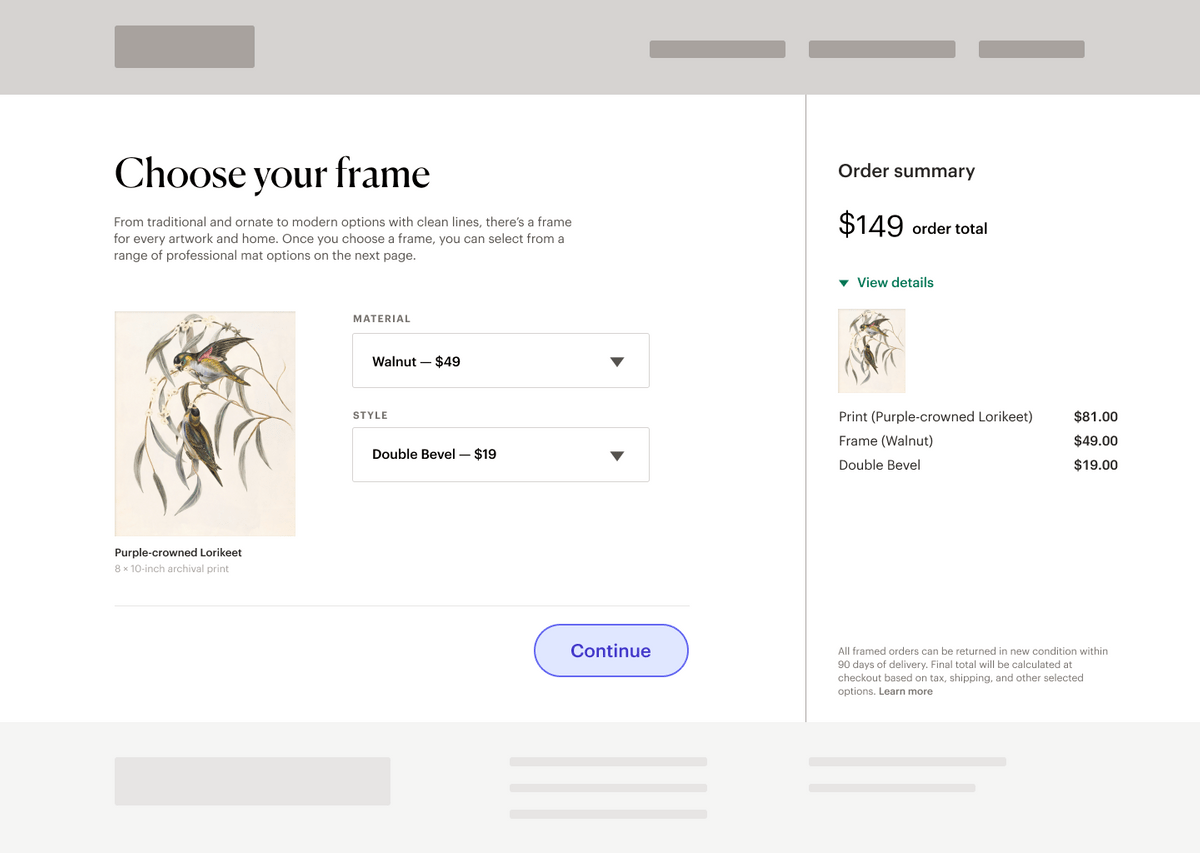
This post is inspired by a real task I recently completed, which was to improve the accessibility of a core ecommerce flow that looked sort of like this:

Our old-school implementation relied on floats and relative width values to achieve something that mostly worked. But there was a problem. Our accessibility team discovered that a typical screen reader user could completely miss the order summary column. The “Continue” button is announced before the summary, and it wasn’t obvious that any critical information existed after that point on the page.
Sighted users don’t necessarily have this problem—the summary is in plain view. Plus, research shows that sighted web users tend to scan a page in an “F” or “Z” pattern.
Given the heading structure and visual hierarchy of this page, an average user would likely scan from the left to the right before moving down to the Continue button. And regardless of how a sighted user scans the page initially, all the content is readily visible.
The team’s directive to was to move that button to the end of the DOM, ensuring any users navigating the page top-to-bottom would hear the summary before moving on to the next step in the flow.
Of course, moving the button in the DOM also moves its visual position. Suddenly it’s at the bottom of the order summary, which we don’t want. Complicating the matter, each column has a dynamic height. The main content area will expand with additional items, and the summary grows in height as users expand order details.
Our goal:
- Maintain the visual design, accounting for dynamic height columns
- Ensure screen reader users hear the order summary before the Continue button. 1
- Account for mobile devices and older browsers
So, how do we go about this?
Assessing the markup
Let’s start with our HTML. The better our underlying document structure, the easier it will be to make sure our flow remains accessible regardless of layout. It’s also what will determine the default order in which screen readers will traverse the page.
Here’s a simplified version of the page’s HTML before any adjustment:
<body>
  <div>
    <div>
      <h1>Choose your frame</h1>
      <p>
        From traditional and ornate to modern options with clean lines, there’s
        a frame for every artwork and home. Once you choose a frame, you can
        select from a range of professional mat options on the next page.
      </p>
      <div class="item-options">
        <figure>
          <img
            src="https://source.unsplash.com/COphCQKS660/200x241"
            alt="Preview of illustrated artwork, Purple-crowned Lorikeet"
          />
          <figcaption>
            <span class="artwork-title">Purple-crowned Lorikeet</span>
            <span class="artwork-type">8 × 10-inch archival print</span>
          </figcaption>
        </figure>
        <form action="" method="post">
          <label for="material">Material</label>
          <div class="select">
            <select name="material" id="material">
              <option value="walnut">Walnut — $49</option>
            </select>
          </div>
          <label for="style">Style</label>
          <div class="select">
            <select name="style" id="style">
              <option value="double-bevel">Double Bevel — $19</option>
            </select>
          </div>
        </form>
      </div>
    </div>
  </div>
  <div class="button-container">
    <button>Continue</button>
  </div>
  <div class="summary-container">
    <h2>Order summary</h2>
    <h3>$149 <span class="total-label">order total</span></h3>
    <details>
      <summary>
        View details
      </summary>
      <img
        src="https://source.unsplash.com/COphCQKS660/200x241"
        alt="Item preview, Purple-crowned Lorikeet"
      />
      <dl>
        <dt>Print (Purple-crowned Lorikeet)</dt>
        <dd>$81.00</dd>
        <dt>Frame (Walnut)</dt>
        <dd>$49.00</dd>
        <dt>Double Bevel</dt>
        <dd>$19.00</dd>
      </dl>
    </details>
    <p class="disclaimer">
      All framed orders can be returned in new condition within 90 days of
      delivery. Final total will be calculated at checkout based on tax,
      shipping, and other selected options. <a href="#">Learn more</a>
    </p>
  </div>
</body>
… and here’s what our HTML looks like after some accessibility-focused updates: 2
<body>
  <main>
    <section>
      <!-- Heading content here -->
      <div class="item-options">
        <figure>
          <img
            src="https://source.unsplash.com/COphCQKS660/200x241"
            alt="Preview of illustrated artwork, Purple-crowned Lorikeet"
          />
          <figcaption>
            <span class="artwork-title">Purple-crowned Lorikeet</span
            ><span class="artwork-type">8 × 10-inch archival print</span>
          </figcaption>
        </figure>
        <!-- Form code here -->
      </div>
    </section>
  </main>
  <aside>
    <!-- Order summary code here  -->
  </aside>
  <nav>
    <button>Continue</button>
  </nav>
</body>
The first thing to notice about our updated document is that we’ve fulfilled the original requirement: the Continue button is now in a more natural position at the bottom of the document. 3
We’ve also swapped out many generic elements with more semantic markup. Using landmark elements like main, aside, and nav doesn’t do much (if anything) in terms of visual style. But these landmarks play a vital role in making our page navigable for screen readers and keyboard users.
In our final design, a sighted user can see the overall page hierarchy and layout. Landmarks give screen reader users explicit clues about our page layout so they can orient themselves and jump between regions, instead of just traversing the DOM top to bottom.
Scott O’Hara has a great post about the importance of landmarks—and how screen reader users can navigate them—if you’d like to learn more.
Notice how even before we add any layout rules, our page looks pretty good (see the CodePen here). Getting our HTML in order is key for accessibility but also for making sure everything works well in older browsers (or situations where our CSS may not load.)
Creating columns
Now, let’s create some columns! Our existing solution to this layout was to assign a float: left; rule to the main content, float: right; to the summary, some percentage-based width rules, and a smattering of other positioning properties to achieve this layout.
What’s the problem?
Moving the button broke our fragile CSS in unexpected ways. Remember that the main content and summary have dynamic heights. A shopper can add more products to their order, expand and collapse detail sections, and interact with the page’s forms. This interactivity can create scenarios that aren’t quite ideal for positioning the button.
For example, when the summary is taller than the main content area, the button would get pushed far below that left-column content, even if we align it properly on the horizontal axis. And if we position the button directly, we run the risk of forms and content overlapping as the button is removed from the natural document flow.
Ultimately, maintaining the layout with float rules across all sorts of flexible scenarios proved to be prohibitively fussy under a tight product deadline—it was time to switch to grid.
Creating the grid
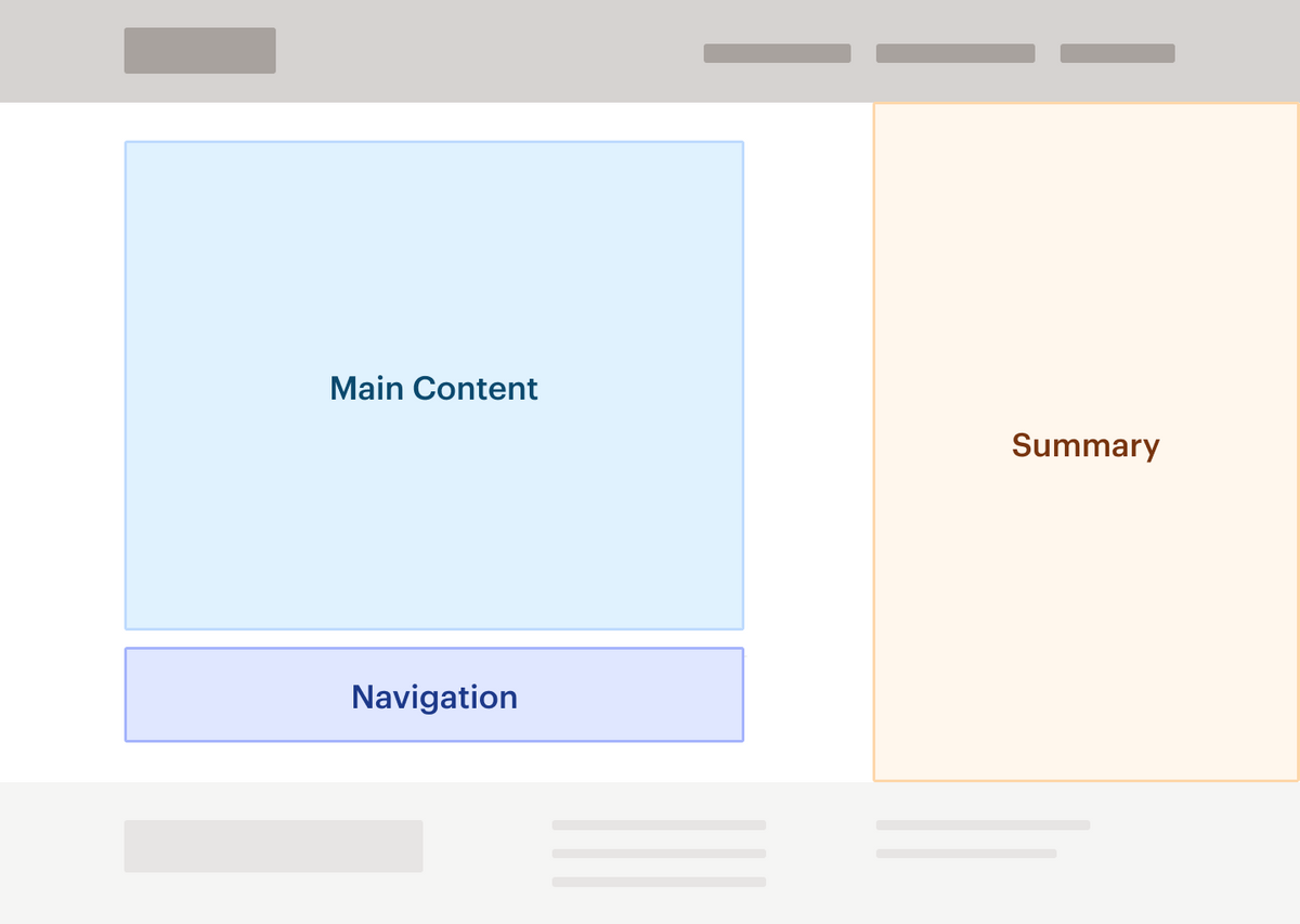
Looking at this layout and knowing the requirements, we can naturally divide it into three distinct sections: main content, the navigation button, and the order summary sidebar.

Thanks to modern CSS, we can set up a grid that closely matches this mental model.
body {
  display: grid;
  grid-template-rows: auto;
  grid-template-columns: 2fr 1fr;
  grid-template-areas:
    "main summary"
    "nav  summary";
}
Just like that, we have a two-column grid. Fractional units ensure the left column takes up two-thirds of the page width, while the summary column takes up the remaining third.
In this example, the grid is applied directly to the body, but if we were actually building out the header and footer we’d likely need a wrapping container.
Now that the grid is established on a common parent, positioning the three regions becomes pretty straightforward. Each just needs a grid-area value corresponding to its appropriate location in the grid. (We’ll also adjust some other values as well to achieve the intended layout.)
main {
  grid-area: main;
  height: 100%;
}

nav {
  grid-area: nav;
  display: flex;
  justify-content: flex-end;
  padding-top: 1em;
  border-top: 1px solid #e7e5e4;
  margin: 2em;
}

aside {
  grid-area: summary;
  display: flex;
  flex-direction: column;
  justify-content: flex-start;
  height: 100%;
  padding: 1.5em 2em;
  border-left: 1px solid #e5e5e5;
}
And, voilà—we’ve properly positioned each element in a two-column grid while maintaining a meaningful document flow for screen reader users. (And got rid of our float headaches.) You can view the full CodePen here.
Finishing touches
We’re in a decent spot with our layout, but there are still a few issues we can fix:
1. Support for IE 11
While we don’t have many users on IE 11 at this point, our grid should work for them too.
Unfortunately, Internet Explorer doesn’t support named grid areas. The fix is easy enough—we can fall back to standard row and column properties to place items on the grid.
aside {
	-ms-grid-row: 1 / 3
	-ms-grid-column: 2 / 3
	grid-area: summary;
}
2. Mobile devices
A two-column layout just doesn’t make sense on smaller screens, so our next step is to define a media query to collapse our grid to a single column for mobile devices (and adjust a few other properties like removing borders). Since we’ve set up our document well, this isn’t a large change:
@media screen and (max-width: 640px) {
  body {
    grid-template-columns: 100%;
    grid-template-rows: auto;
    grid-template-areas:
      "main"
      "summary"
      "nav";
  }
  .item-options {
    flex-direction: column;
  }
  aside {
    grid-area: summary;
    padding: 1em 10%;
    border: none;
  }

  p.disclaimer {
    margin-top: 2em;
  }

  nav {
    grid-area: nav;
    justify-content: center;
    padding: 1em;
  }

  nav button {
    width: 50%;
  }
}
One thing to keep in mind: our borders are set up for the two-column layout, so we’ll also need to adjust them accordingly for our stacked-content version.
3. Right-to-left languages
The “F” pattern we mentioned earlier doesn’t hold for right-to-left languages, like Arabic or Hebrew. So if our customer base has a high percentage of shoppers—or if the app is localized for any right-to-left languages—we may need to adjust our grid to accommodate different reading patterns.
A proper solution is a little more complex than adding in a media query, and definitely outside the scope of this post. That said, setting the CSS property direction: rtl is helpful—our columns will automatically flip, but we can still place content into named grid areas.
So with a little JavaScript or server-side logic sprinkled in, you can wrap content in a class to apply the direction (along with other CSS adjustments) and still achieve much of the same effect.
Wrapping up
There are a lot of articles out there touting the importance of matching visual order to the DOM, for good reason! But in cases like this, the true visual order of a page may not be clear, or it may depend on outside context. Either way, grid is a great tool for managing complex layouts with accessibility in mind.
If you enjoyed this post, I highly recommend reading MDN’s guide, CSS Grid Layout and Progressive Enhancement . Not only does it cover how to implement grid in production, but details even more methods for creating graceful grid fallbacks in your code.
P.S. If you enjoyed this post, or have any thoughts/questions/feedback, don’t hesitate to reach out to me on Twitter!
- Bonus: we’ll let them move around, but traversing the page linearly should still work okay↩
- Some HTML is removed for concision and to draw focus to relevant changes. You can view the full code here.↩
- The real-world inspiration for this post is a React app. And the specific structure of the app limited our ability to move around navigation logic without significant refactoring work. In this case, a React portal was enormously helpful, as we could keep the button in the same part of our component tree and render it exactly where we needed to in the actual DOM.↩